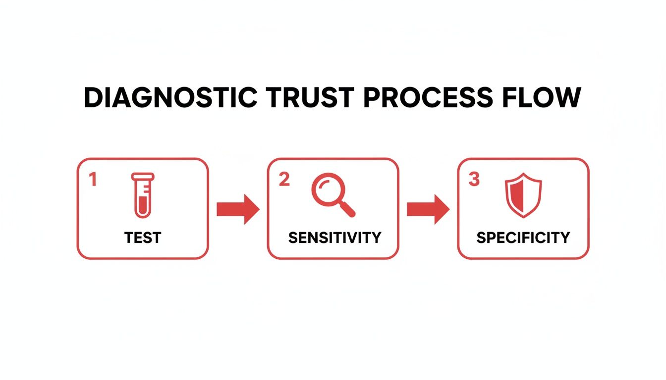
At its core, understanding sensitivity and specificity is all about knowing how much you can trust a medical test. It’s the difference between a test that’s great at finding a disease versus one that’s great at confirming it. Think of them as two distinct types of quality control for any diagnostic tool you’ll ever use.
Understanding Sensitivity And Specificity In Diagnostics
Let's use a simple analogy every medical student can appreciate: a smoke detector. Its job is to find a fire, but how it’s calibrated makes all the difference. This is a perfect way to break down sensitivity and specificity, two absolute cornerstones of diagnostics you have to master for USMLE Step 1.
A highly sensitive smoke detector is designed to catch every possible sign of fire. It will scream bloody murder for a raging inferno, but it will also likely go off if you just burn some toast. This test is fantastic at identifying potential problems and is very unlikely to miss a real one.
Sensitivity is the ability of a test to correctly identify patients who have the disease. It answers the question: "Of all the people who are actually sick, what percentage tested positive?"
On the other hand, a highly specific smoke detector is fine-tuned to only go off for a genuine, serious fire. It completely ignores the burnt toast, preventing all those annoying false alarms. The trade-off? It might not detect a small, smoldering fire hidden in the walls. Its strength is in confirming a real problem with confidence.
Specificity is the ability of a test to correctly identify patients who do not have the disease. It answers the question: "Of all the people who are healthy, what percentage tested negative?"
Mnemonics Every Student Should Know
To keep these straight during a high-pressure exam, you absolutely need these two mnemonics. They are your lifeline for quickly applying these concepts to clinical vignettes.
- SnNOut: A test with high Sensitivity, when Negative, helps to rule Out the disease. (Like the sensitive smoke detector that stays silent—you're pretty confident there's no fire.)
- SpPIn: A test with high Specificity, when Positive, helps to rule In the disease. (Like the selective detector that finally goes off—you're almost certain it's a real fire.)
To help you quickly reference these two critical metrics, here’s a simple table breaking down their key differences.
Sensitivity Vs Specificity At A Glance
| Metric | What It Answers | Formula | Focus Population | Key Use Case |
|---|---|---|---|---|
| Sensitivity | "If a person has the disease, how often will the test be positive?" | TP / (TP + FN) | All individuals with the disease | Screening tests; Ruling OUT a disease |
| Specificity | "If a person does not have the disease, how often will the test be negative?" | TN / (TN + FP) | All individuals without the disease | Confirmatory tests; Ruling IN a disease |
These concepts, formally introduced way back in 1947, are the bedrock of evidence-based medicine. You'll see them calculated from the 2×2 table: Sensitivity is True Positives (TP) / (TP + False Negatives), while Specificity is True Negatives (TN) / (TN + False Positives). Mastering this isn't just a suggestion—it's essential for the USMLE, as detailed in biostatistics guides. You can explore more about these foundational concepts on NCBI.
Grasping how these metrics work is crucial for interpreting any lab work, from a simple CBC to complex genetic screening. For a deeper dive into practical applications, check out this excellent guide on understanding your blood test results. Ultimately, this knowledge forms the foundation of strong clinical reasoning, a skill we explore in depth in our other resources. Read our guide on what is clinical reasoning to learn more.
Building The 2×2 Table From The Ground Up
The 2×2 contingency table is your single most important tool for crushing any question about sensitivity and specificity. It might look like a confusing grid of letters at first, but trust me, learning to build it from the ground up is the secret to making these calculations feel second nature.
Once you master this simple structure, you’ll never have to second-guess the formulas again.
Let's start with a simple, non-medical analogy to make things click. Imagine a new airport security scanner designed to catch corporate spies trying to smuggle out company secrets. The scanner's only job is to flag potential threats (the spies) while letting regular, innocent employees pass through without a fuss.
This visual helps clarify how testing, sensitivity, and specificity all fit together.
Think of it this way: sensitivity is the tool that detects a potential problem, while specificity is the shield that confirms if the problem is real.
Defining The Four Outcomes
Every single person who walks through that scanner will fall into one of four categories. These four outcomes are the building blocks of our 2×2 table:
- True Positive (TP): The scanner correctly beeps, identifying an actual corporate spy. The test is positive, and the person really is a threat.
- False Positive (FP): The scanner beeps, but it’s just a harmless employee with a weird metal pen in their pocket. The test is positive, but the person is not a threat.
- True Negative (TN): The scanner stays silent as a regular employee walks through. The test is negative, and the person is not a threat.
- False Negative (FN): The ultimate failure. The scanner stays silent, but a cunning spy slips through completely undetected. The test is negative, but the person is a threat.
Key Takeaway: A "True" result means the test matched reality perfectly. A "False" result means the test got it wrong. Remember, "Positive" and "Negative" refer only to the test's result, not the person's actual status.
Structuring The Clinical 2×2 Table
Now, let's translate this into a clinical scenario. The structure of the table is always the same, and it’s something you absolutely have to memorize. The actual disease status—the "gold standard"—always goes in the rows, and the new test's results always go in the columns.
Here’s the standard layout you need to know:
| Test Positive | Test Negative | Row Total | |
|---|---|---|---|
| Disease Present | True Positive (TP) | False Negative (FN) | TP + FN (All Sick) |
| Disease Absent | False Positive (FP) | True Negative (TN) | FP + TN (All Healthy) |
| Column Total | TP + FP (All Test Pos) | FN + TN (All Test Neg) | Grand Total |
Pay close attention to the totals—they give you crucial information. The row total for "Disease Present" tells you everyone who actually has the disease. The column total for "Test Positive" tells you everyone who got a positive test result, whether they're truly sick or not.
Understanding this distinction is absolutely vital for all the calculations that follow. Before you can tackle other clinical metrics, you have to nail this down. For instance, if you want to understand another key measure, check out our guide on the number needed to treat.
Putting Sensitivity And Specificity To The Test: Clinical Examples
Alright, the theory is down. But on exam day and in the clinic, you won't be just reciting formulas—you'll be applying them. Let's make this real by walking through a couple of clinical scenarios.
First, we'll tackle a straightforward problem where the 2×2 table is already laid out. This lets you focus purely on the math. Then, we’ll move on to a more realistic, USMLE-style vignette where you have to pull the important details out of a clinical story. This is a critical skill that separates the good scores from the great ones.
Example 1: A Straightforward Calculation
Let's say a new rapid test for Strep Pharyngitis is under review. Researchers enroll 200 patients presenting with a sore throat. The gold standard—a throat culture—confirms that 50 of these patients genuinely have strep, while 150 do not.
The new rapid test flags 45 of the sick patients as positive. However, it also incorrectly flags 15 healthy patients as positive. Let's plug this into our 2×2 table and see what we've got.
| Test Positive | Test Negative | Row Total | |
|---|---|---|---|
| Disease Present | 45 (TP) | 5 (FN) | 50 (All Sick) |
| Disease Absent | 15 (FP) | 135 (TN) | 150 (All Healthy) |
| Column Total | 60 (All Test Pos) | 140 (All Test Neg) | 200 (Grand Total) |
With the table organized like this, the calculations are just plug-and-chug.
Calculating Sensitivity: Remember, sensitivity is all about the "Disease Present" row.
- Formula: Sensitivity = TP / (TP + FN)
- Calculation: 45 / (45 + 5) = 45 / 50 = 0.90 or 90%
Calculating Specificity: Now, we shift focus to the "Disease Absent" row for specificity.
- Formula: Specificity = TN / (TN + FP)
- Calculation: 135 / (135 + 15) = 135 / 150 = 0.90 or 90%
So, this new rapid test has a 90% sensitivity, meaning it correctly identifies 90% of people who truly have strep. It also boasts a 90% specificity, correctly giving a negative result to 90% of people who don't have it. Not too shabby.
Example 2: The Clinical Vignette
Now for something that feels more like a real board question.
A pediatrician is evaluating a new screening tool designed to spot developmental language disorders in 5-year-olds before they enter kindergarten. The goal is twofold: catch the kids who need early help, but just as importantly, avoid causing unnecessary stress for parents of typically developing children.
The tool is tested against the gold standard evaluation by a speech-language pathologist and found to have 84% sensitivity and 98% specificity. So, what do these numbers actually mean in the real world?
This is a classic board-style question. It’s not about the numbers themselves, but what those numbers mean for your patients and the healthcare system. For screening tests, high specificity is often the hero to prevent the harm of false positives.
Let’s break down what these stats imply for our pediatrician.
- High Specificity (98%): This is the star of the show here. A 98% specificity means that for every 100 typically developing kids who take the test, 98 will correctly test negative. This is hugely important. A false positive can spiral into expensive specialist referrals, further testing, and a mountain of parental anxiety. For any screening test rolled out to a large population, minimizing false positives is paramount.
- Solid Sensitivity (84%): It’s not perfect, but 84% is still quite good. This means the test correctly identifies the vast majority (84 out of 100) of children who genuinely have a language disorder. This ensures most at-risk kids get flagged for the kind of early intervention that can change the entire trajectory of their academic and social lives.
In fact, one real-world study on pediatric screening found that a specific cutoff score on a language assessment yielded an identical 84% sensitivity and 98% specificity. This shows how designers of these tests carefully balance the need to find true cases without over-burdening the system with false alarms. You can read more about the clinical reasoning behind these trade-offs in developmental assessments.
This balance between catching most cases and avoiding false alarms is what makes a screening tool clinically useful.
And if you’re managing a patient with endocrine issues, our guide on how to interpret thyroid function tests might be a helpful next read.
How Prevalence Impacts PPV And NPV
Here’s a concept that trips up even the sharpest medical students: while sensitivity and specificity are baked-in characteristics of a diagnostic test, the Positive Predictive Value (PPV) and Negative Predictive Value (NPV) are anything but. These crucial numbers shift dramatically depending on the population you're testing.
This is one of the most important, high-yield ideas for real-world clinical thinking. Sensitivity and specificity tell you how good the test is in a lab setting. But PPV and NPV tell you how useful the results are for the actual patient sitting in front of you. They answer the gut-punch questions: "Doc, my test was positive. What are the chances I actually have this disease?" That's PPV.

The Power Of Prevalence
At its core, prevalence is just how common a disease is within a specific group. Is it a zebra diagnosis, affecting 1 in 10,000 people? Or is it a common cold, affecting 1 in 4 people in your waiting room? This one factor has a massive influence on your test's predictive power.
Let's make this concrete with a clinical example: screening for prostate cancer. Imagine a new test with fantastic sensitivity (98%) but pretty terrible specificity (16%).
Scenario 1: Low-Prevalence Population
You decide to use this test for a general screening of young, asymptomatic men where the prevalence of prostate cancer is extremely low (let's say 1%). Because the disease is so rare, the vast majority of positive results will be false alarms. The PPV will be catastrophically low. A positive result here is far more likely to be wrong than right, leading to countless unnecessary, invasive, and anxiety-inducing biopsies.Scenario 2: High-Prevalence Population
Now, take that exact same test and use it in a high-risk urology clinic for older men with strong family histories and concerning symptoms. In this group, the prevalence might be much higher (say, 30%). All of a sudden, a positive result is much more likely to be a true positive. The PPV skyrockets, and the test becomes a far more useful tool.
Key Takeaway: A test's sensitivity and specificity don't change. What changes is the underlying probability of disease in the person being tested. High prevalence drives PPV up, while low prevalence tanks it.
This isn't just a hypothetical. A real-world study on using PSA density (PSAD) to detect prostate cancer showed 98% sensitivity but only 16% specificity. In the study's high-risk group where disease prevalence was 23%, the PPV was still a fairly low ~27%, while the NPV was a very reassuring 98%. You can read more on these findings on prostate cancer screening from the full study.
How Prevalence Transforms Predictive Values
To really drive this home, let's look at the numbers. The table below shows how PPV and NPV change for a hypothetical test with a fixed sensitivity of 90% and specificity of 95% when used in populations with different disease prevalence.
| Disease Prevalence | Positive Predictive Value (PPV) | Negative Predictive Value (NPV) | What This Means Clinically |
|---|---|---|---|
| 0.1% (Rare Disease) | 1.8% | 99.9% | A positive result is almost certainly a false alarm (98.2% chance). A negative result is extremely reliable. |
| 1% (Uncommon) | 15.4% | 99.9% | Only ~15% of positive results are true. The test generates many false positives. NPV remains excellent. |
| 10% (Common) | 67.9% | 98.8% | A positive result is now more likely true than false, but still has a ~32% chance of being wrong. |
| 50% (Very Common) | 94.7% | 90.5% | In a high-risk group, the test is very reliable. A positive result is highly predictive, but the NPV starts to drop. |
Notice how the PPV rockets from a measly 1.8% to a robust 94.7% using the exact same test, just by changing the patient population. That’s the power of prevalence.
Connecting Prevalence To Clinical Decisions
Grasping this relationship is essential for making sound clinical judgments. It’s why we don’t screen the general public for rare diseases with imperfect tests—the sheer number of false positives would overwhelm the healthcare system and cause immense patient harm.
It also explains why the same test can be a lifesaver in one clinical setting and nearly useless in another. Before you even think about ordering a test, you have to ask yourself: "What is my pre-test probability?" This crucial step in building a differential diagnosis is what allows you to interpret the results correctly.
This concept is a favorite on USMLE Step 2 and Step 3, where questions force you to interpret test results in the context of a patient's specific risk factors and clinical picture. Mastering how prevalence shapes PPV and NPV is a huge step toward thinking like an attending physician.
Navigating ROC Curves And Likelihood Ratios
Once you're comfortable with the 2×2 table, it's time to level up. Two concepts—the Receiver Operating Characteristic (ROC) curve and Likelihood Ratios (LRs)—will truly deepen your understanding of a test's performance.
They might sound intimidating, but they’re powerful, intuitive tools. Think of them as the graduate-level skills for mastering what is sensitivity and specificity. They help you see the trade-offs in any test and precisely adjust your clinical judgment based on a result.

Visualizing The Trade-Off With ROC Curves
Imagine a diagnostic test that gives a continuous result, like a blood glucose level, instead of a simple "positive" or "negative." Where you set the cutoff for "abnormal" is a balancing act that directly impacts sensitivity and specificity. This is exactly what the ROC curve helps you visualize.
An ROC curve is a graph that plots the True Positive Rate (Sensitivity) on the y-axis against the False Positive Rate (1 – Specificity) on the x-axis for every possible cutoff point.
Here’s how to read it:
- A low cutoff (e.g., calling any glucose over 100 abnormal) catches almost everyone with the disease. This gives you high sensitivity. But, it also mislabels many healthy people, leading to a high false positive rate and low specificity. This point lives on the top right of the curve.
- A high cutoff (e.g., only flagging glucose over 250 as abnormal) will be extremely specific, correctly identifying nearly all healthy individuals. The trade-off? You'll miss a lot of true cases, resulting in low sensitivity. This point is found on the bottom left.
A perfect test would shoot straight up to the top-left corner, representing 100% sensitivity and 100% specificity. A useless test, no better than a coin flip, is represented by the diagonal line running from (0,0) to (1,1).
The real power of the ROC curve is boiled down into a single number: the Area Under the Curve (AUC). The AUC, ranging from 0 to 1, represents the test's overall diagnostic power across all possible thresholds. An AUC of 1.0 is a perfect test, while an AUC of 0.5 is completely useless.
Using Likelihood Ratios To Adjust Clinical Suspicion
While ROC curves are great for comparing different tests, Likelihood Ratios (LRs) tell you how much a specific test result should change your clinical suspicion. Think of them as "odds multipliers" that bridge the gap between your pre-test and post-test probability.
You'll need to know two key types:
- Positive Likelihood Ratio (LR+): This tells you how much more likely a positive result is in someone with the disease compared to someone without it. A high LR+ (usually >10) makes you much more confident the disease is present, reinforcing the SpPIn mnemonic.
- Negative Likelihood Ratio (LR-): This tells you how much more likely a negative result is in a person with the disease versus someone without it. A very low LR- (usually <0.1) makes the disease far less likely, which perfectly aligns with the SnNOut mnemonic.
For example, an LR+ of 20 means a positive test makes the odds of having the disease 20 times higher. On the flip side, an LR- of 0.05 means a negative result makes the odds of disease 20 times lower.
These ratios offer a much more nuanced view than a simple "positive" or "negative," allowing you to dynamically update your clinical judgment with hard data.
Avoiding Common Mistakes On Exam Day
When the clock is ticking on exam day, it’s painfully easy for even the most prepared students to fall into common biostats traps. Let's be honest, the pressure is immense. The key isn't just memorizing formulas; it's about building a calm, systematic approach that stops you from making simple errors when it counts the most.
Let's break down the most frequent mistakes I see and, more importantly, how to sidestep them.
The single biggest error is confusing sensitivity with Positive Predictive Value (PPV). They sound alike and both involve positive test results, but they answer fundamentally different questions. This isn't just semantics—mixing them up will lead you to the wrong answer every time.
Sensitivity is a fixed characteristic of a lab test itself. PPV, on the other hand, is all about the patient population and is massively influenced by how common the disease is (prevalence).
Remember this distinction: Sensitivity answers the test's question: "How well does my test find the disease in people who have it?" PPV answers the clinician's question: "My patient tested positive. What's the real chance they actually have the disease?"
This is a critical point. You can have a test with fantastic sensitivity that still produces a terrible PPV if the disease is incredibly rare. Why? Because you'll get a flood of false positives that overwhelm the few true positives. When you're reading a question stem, be on high alert for any mention of prevalence—it's a massive clue that they're pushing you toward predictive values, not just the test's built-in specs.
Quick-Fire Memory Aids For Exam Day
Drilling your mnemonics is one of the highest-yield things you can do. You probably know the classics, but let's lock them in and add a couple more to your arsenal so you can fire them off under pressure.
- SnNOut: A highly Sensitive test with a Negative result helps rule Out the disease. Think screening.
- SpPIn: A highly Specific test with a Positive result helps rule In the disease. Think confirmation.
- PID/NIH: A great little trick for remembering the core formulas from the 2×2 table. Positive In Disease (Sensitivity: TP/TP+FN) and Negative In Health (Specificity: TN/TN+FP).
- Vertical vs. Horizontal: This one saves lives on exam day. You calculate sensitivity and specificity by reading down the columns (based on true disease status). You calculate PPV and NPV by reading across the rows (based on the test result).
Common Calculation Pitfalls
Another place students lose easy points is by misplacing numbers in the 2×2 table when pulling them from a long clinical vignette. It happens to the best of us. You’re rushing, you’re stressed, and suddenly a value ends up in the wrong box, which torpedoes every single calculation that follows.
Here’s how to prevent that. Before you do anything else, draw your 2×2 grid and label the columns "Disease +/-" and the rows "Test +/-". Then, slowly and methodically, fill in the numbers from the stem one by one.
The final, crucial step: add up your grand total and make sure it matches the total number of patients mentioned in the question. This simple check takes five seconds and can catch a slip-up before it costs you a question. By drilling this systematic process, you build the muscle memory to tackle any biostats problem calmly and accurately.
Test Your Knowledge With USMLE-Style Questions
Alright, the best way to make sure these concepts really stick is to put them to the test under a bit of pressure. This final section has a couple of high-quality, board-style practice questions designed to feel just like the real USMLE.
Each vignette asks for more than just plugging numbers into a formula—it demands you think like a clinician.
Give them your best shot, then dive into the detailed answer explanations below. We don’t just give you the answer; we show you exactly how to set up the 2×2 table, walk through the math, and most importantly, explain the clinical reasoning behind it. This kind of active practice is what separates a good score from a great one on exam day.
Question 1 Clinical Vignette
Researchers are evaluating a new rapid diagnostic test for Clostridium difficile infection in a cohort of 300 hospitalized patients with diarrhea. A stool culture, the gold standard, confirms that 50 of these patients have the infection. The new rapid test correctly identifies 40 of these infected patients. Among the 250 patients without the infection, the new test correctly identifies 225 as negative.
Based on this information, which of the following best represents the sensitivity of this new rapid test?
- (A) 16.7%
- (B) 80.0%
- (C) 83.3%
- (D) 90.0%
- (E) 91.7%
Question 2 Clinical Vignette
A new biomarker is proposed for the early detection of a rare but aggressive form of pancreatic cancer. In a trial, the test demonstrates a specificity of 99%. You are a primary care physician seeing a 45-year-old asymptomatic patient with no family history of cancer who asks for this test as part of a routine check-up. The prevalence of this cancer in the general population is extremely low.
Which of the following mnemonics is most helpful in counseling the patient about a potential positive result from this test?
- (A) SpPIn (High Specificity, Positive test, rules In)
- (B) SnNOut (High Sensitivity, Negative test, rules Out)
- (C) PID (Positive In Disease)
- (D) NIH (Negative In Health)
- (E) PPV decreases as prevalence decreases
Answer Explanations And Walkthroughs
Ready to see how you did? Let's break down each question, step-by-step.
Explanation for Question 1
The correct answer is (B) 80.0%.
Your first move for any of these questions should be to organize the data into a 2×2 table. It keeps everything straight.
- Total Patients: 300
- Disease Present (Gold Standard): 50
- Disease Absent: 300 – 50 = 250
- True Positives (TP): The test correctly found 40 of the 50 sick patients. So, TP = 40.
- True Negatives (TN): The test correctly cleared 225 of the 250 healthy patients. So, TN = 225.
Now we can fill in the rest of the table just by doing some simple subtraction.
| Test Positive | Test Negative | Row Total | |
|---|---|---|---|
| Disease Present | 40 (TP) | 10 (FN) | 50 (All Sick) |
| Disease Absent | 25 (FP) | 225 (TN) | 250 (All Healthy) |
| Column Total | 65 | 235 | 300 |
The question is asking for sensitivity. Remember, the formula for sensitivity is TP / (TP + FN), or "how well does the test pick up the disease in everyone who actually has the disease?"
- Calculation: 40 / (40 + 10) = 40 / 50 = 0.80 or 80.0%.
Explanation for Question 2
The correct answer is (E) PPV decreases as prevalence decreases.
This is a classic USMLE-style trap. SpPIn is tempting because the stem mentions high specificity. But SpPIn is most useful when you have a high pre-test probability. In a low-prevalence screening scenario like this, even a hyper-specific test will generate a shocking number of false positives.
The real heart of this question is the relationship between specificity, prevalence, and PPV. Because this is a rare cancer, the pre-test probability is incredibly low. This means that even with a positive result, it's far more likely to be a false positive than a true positive.
The result is a dismal Positive Predictive Value (PPV). Your counseling has to focus on this reality to manage the patient's expectations and prevent a tidal wave of unnecessary anxiety and follow-up tests.
If you want to keep practicing, you can find more USMLE Step 2 CK sample questions that hit on a wide range of biostats and clinical scenarios.
Nailing complex topics like sensitivity and specificity is what separates good scores from great ones. If you're looking for personalized guidance to conquer the USMLE, COMLEX, or your Shelf exams, Ace Med Boards offers one-on-one tutoring designed to elevate your score. Start with a free consultation today!